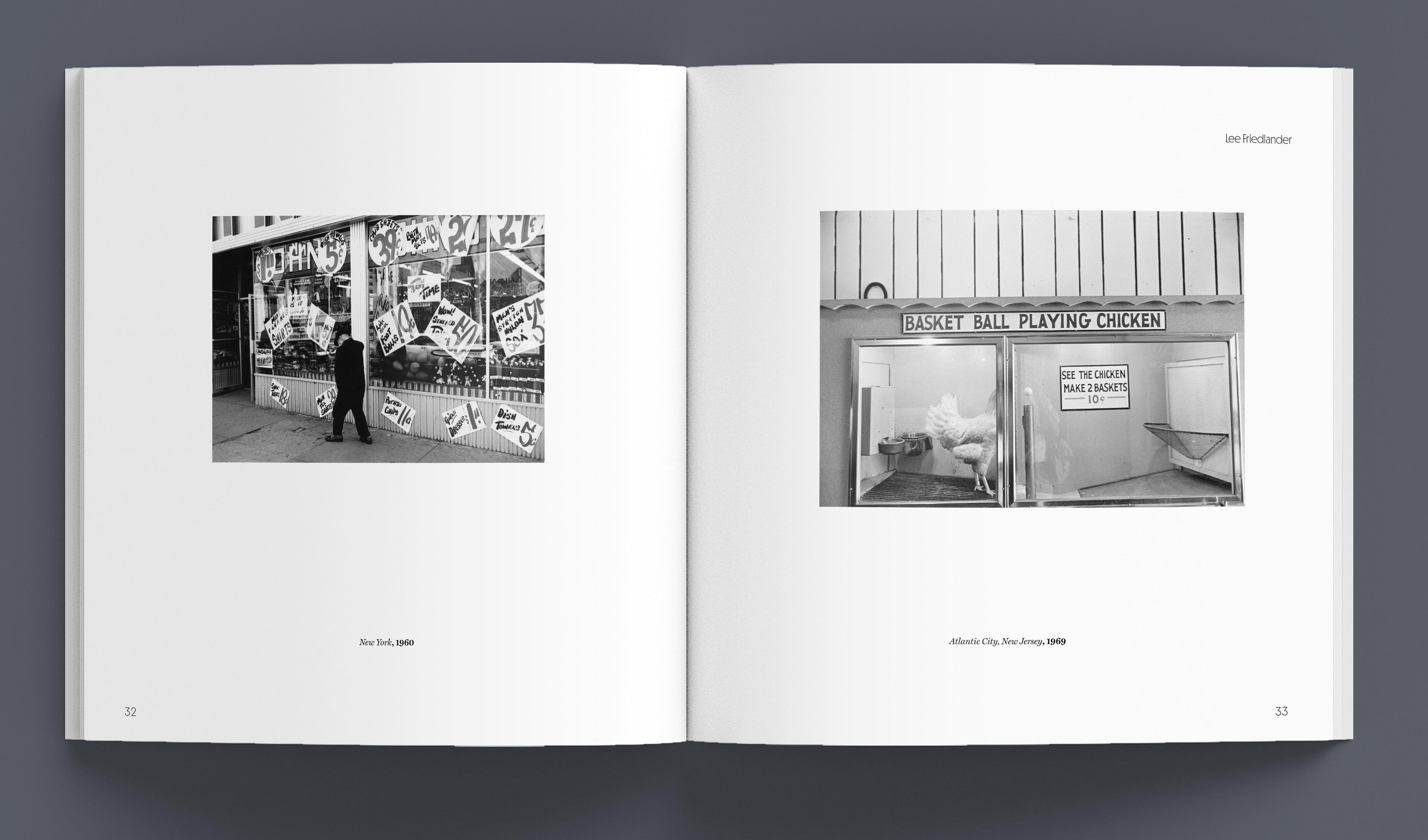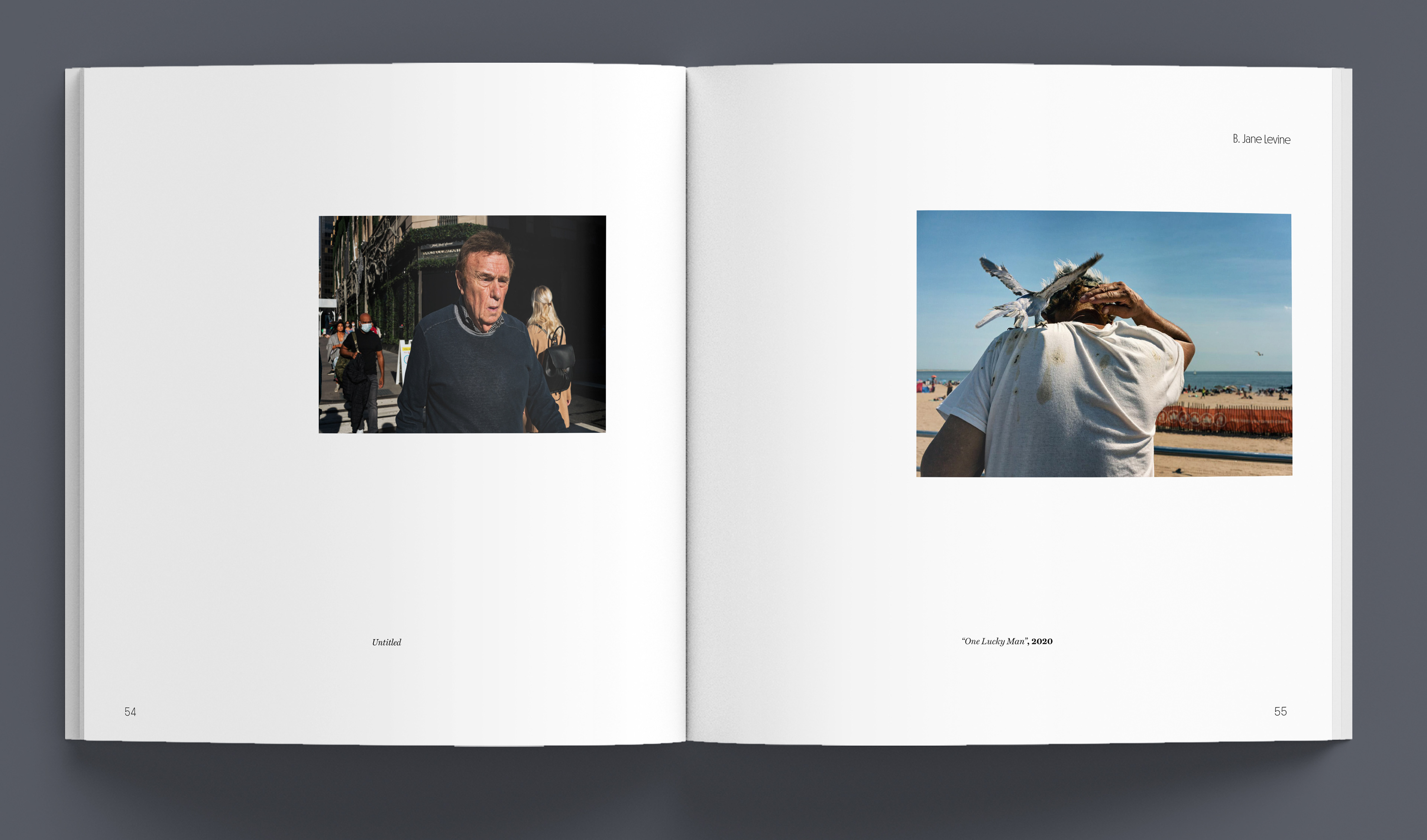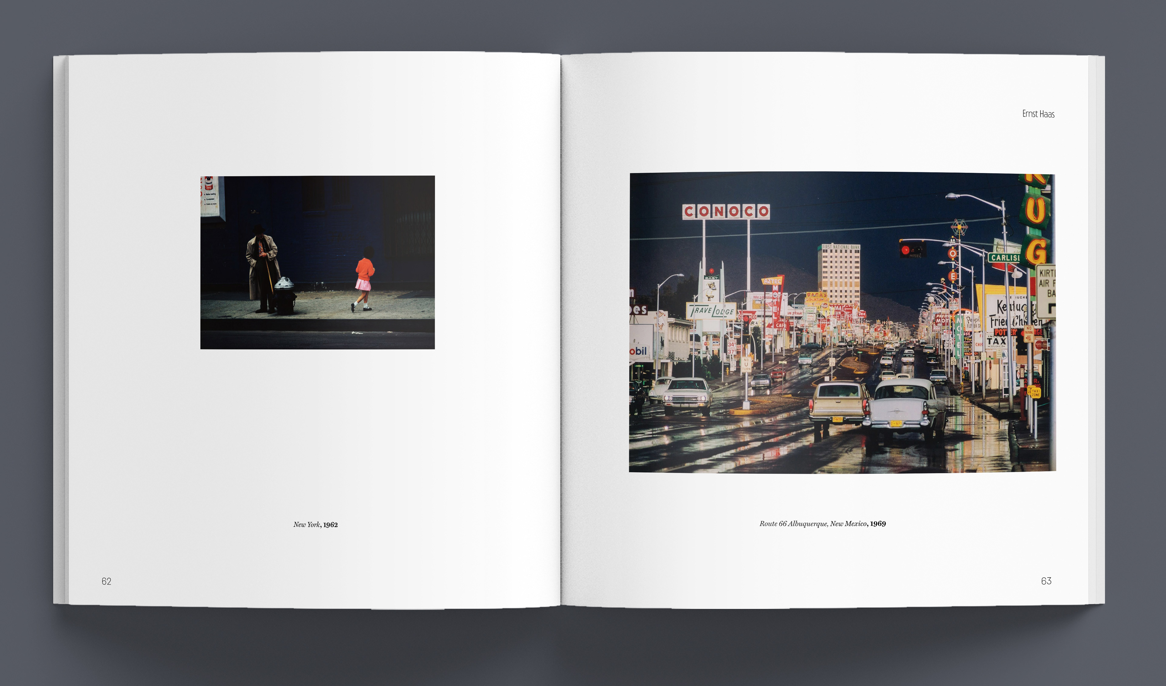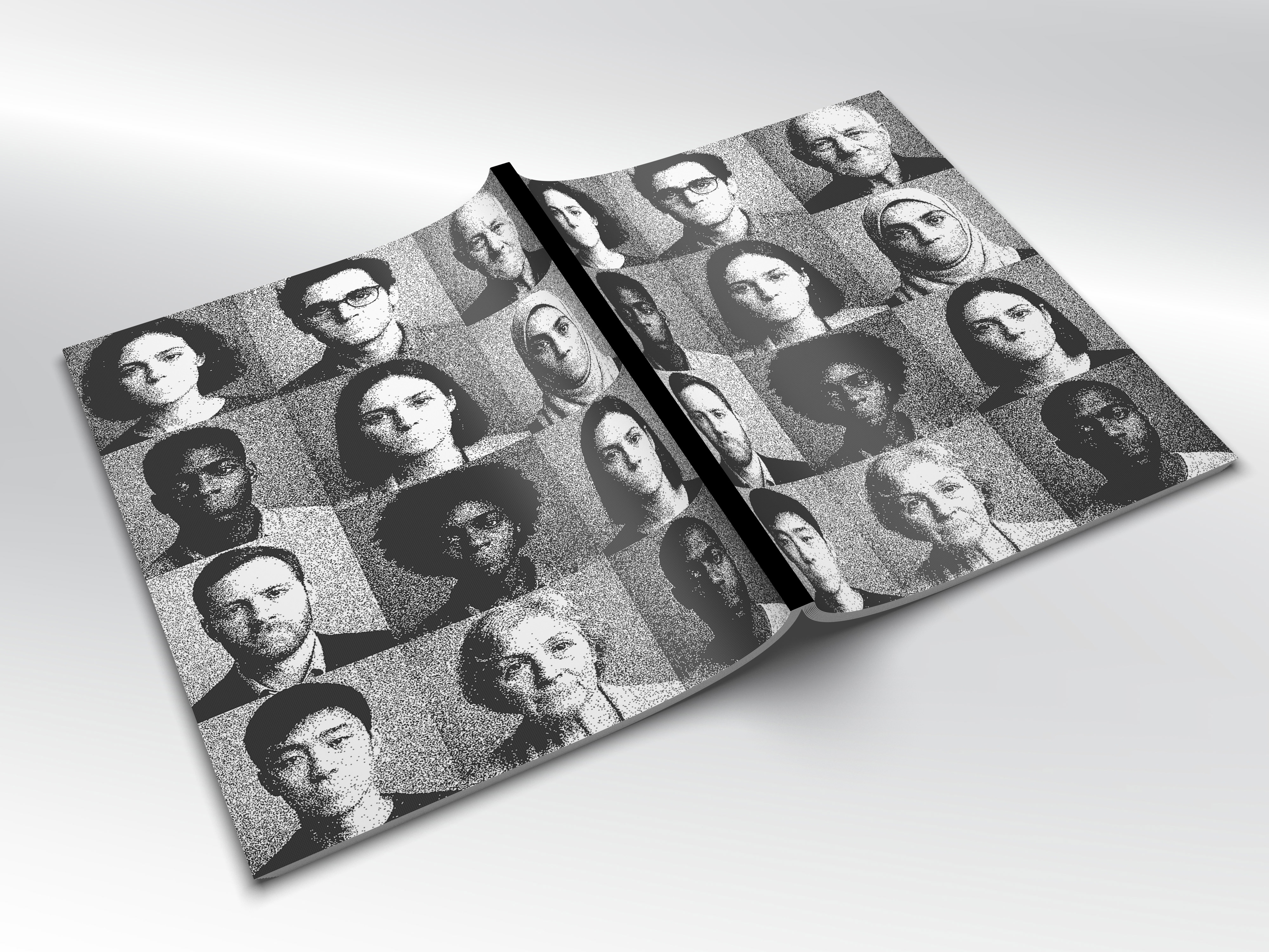
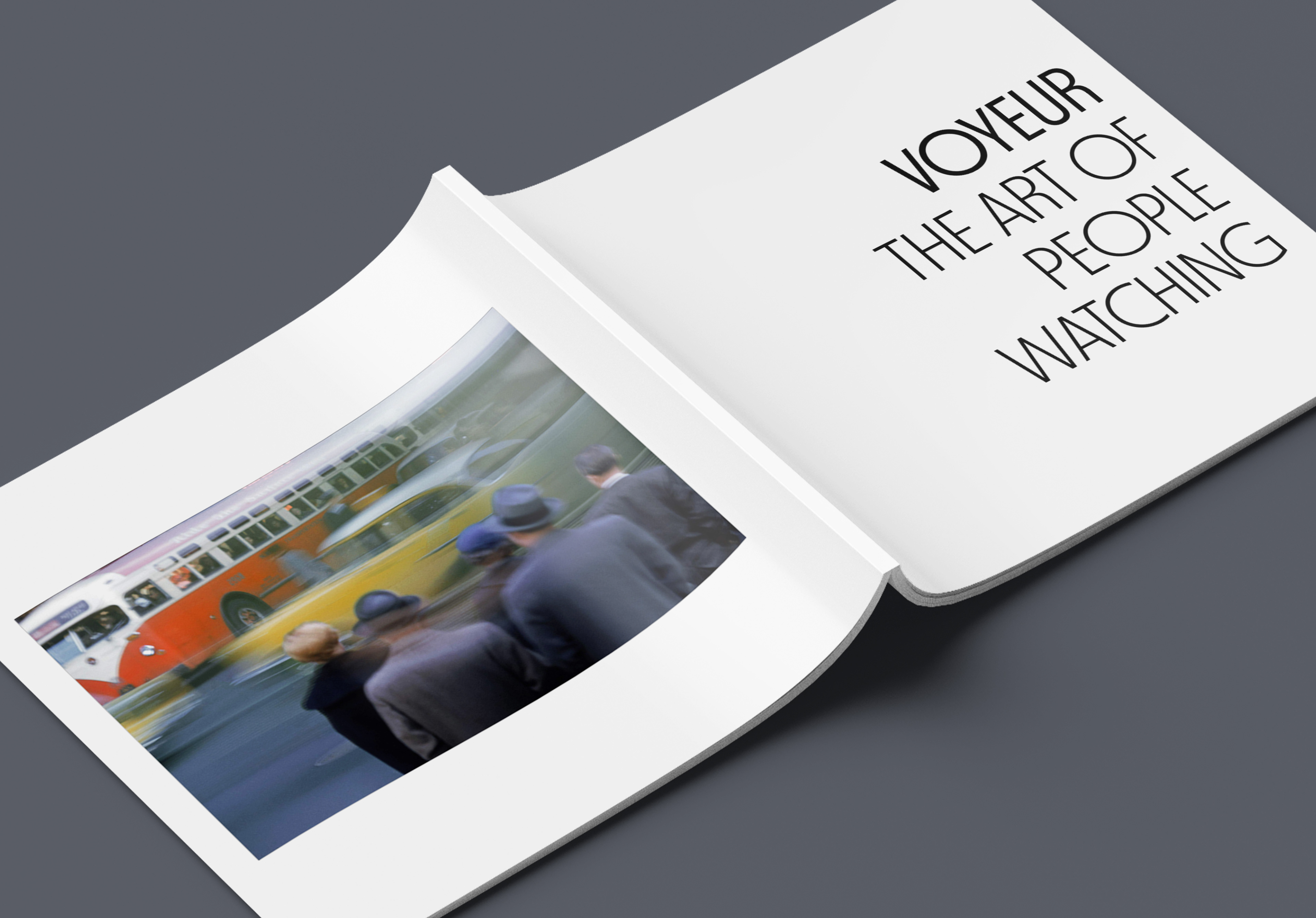
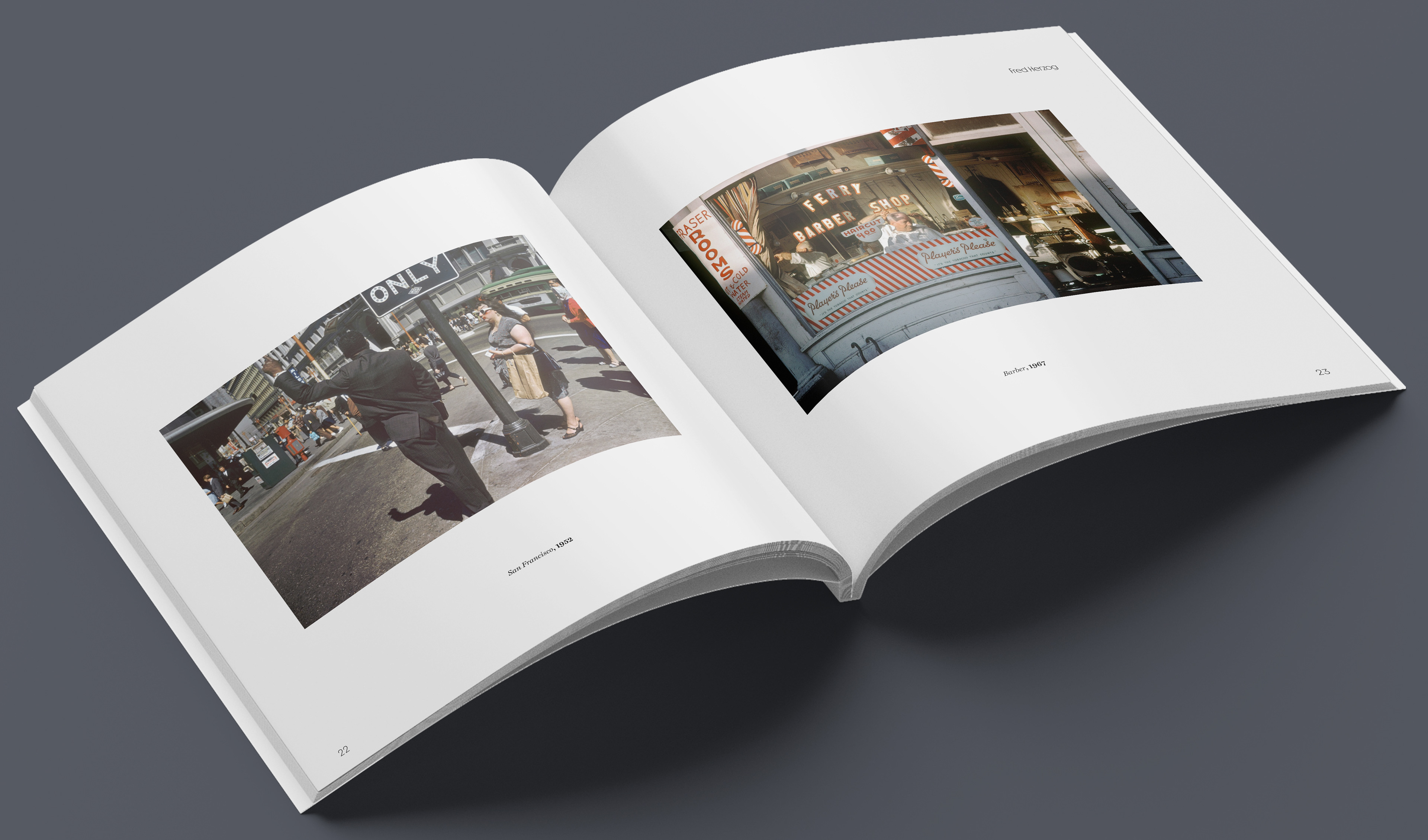
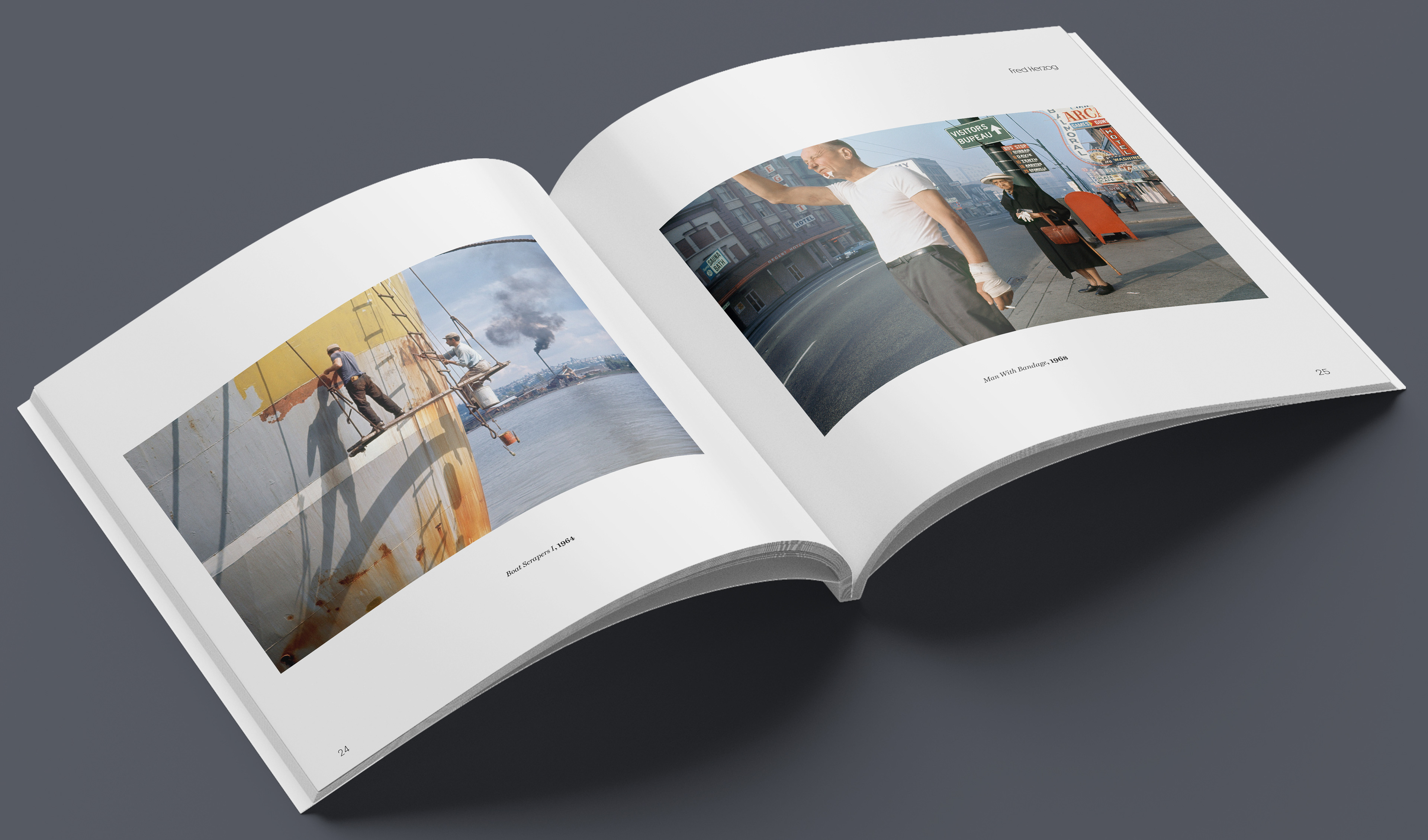
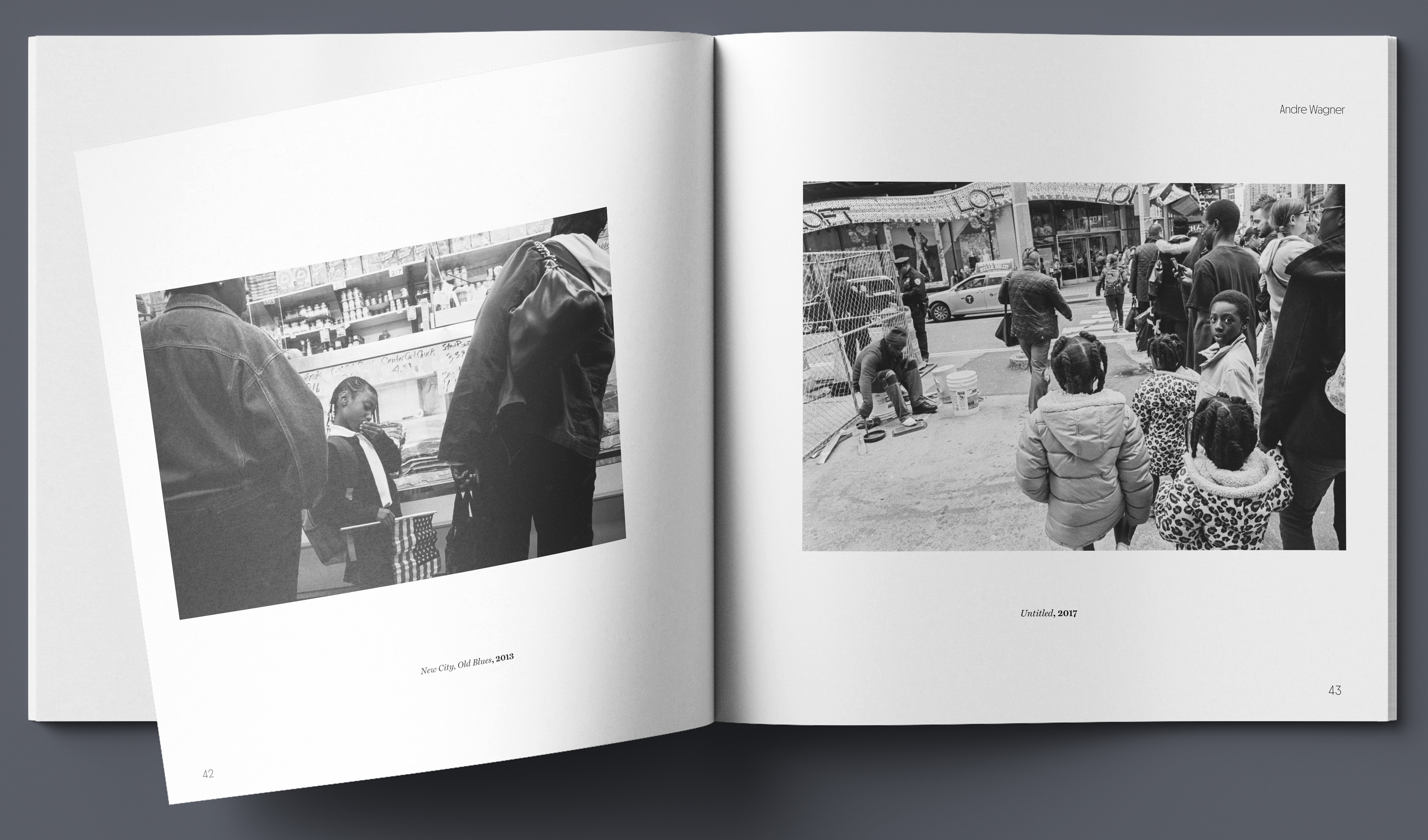
VOYEUR is a museum catalogue that serves as a meditation on urban life, that pivots away from the usual confrontational presence that
street photography imposes. The article by Alyssa Opris explains the thinking that justifies the artists' decisions–positioning the lense behind glass, through surrounding architecture, and in the anonymity of a crowd. This distant viewpoint situates the the viewer as a silent, uninvited observer.
street photography imposes. The article by Alyssa Opris explains the thinking that justifies the artists' decisions–positioning the lense behind glass, through surrounding architecture, and in the anonymity of a crowd. This distant viewpoint situates the the viewer as a silent, uninvited observer.
There is a deliberate positioning that amplifies a unique sense of intimacy, and captures the raw, candid, vulnerability of subjects who believe they are alone. This style takes the act of 'people watching' and elevates it from a casual pastime to an evocative art form, that reveals the quiet beauty of the mundane and the ghostly tension of witnessing life from the periphery.
Why Read?
This Catalogue is intended to show how photographers use the power of observation and composition when observing subjects in their natural state. The reader will find visually interesting ways of capturing the beauty in the mundane, and hopefully have a appreciation for the 'little things' around them
Feel, Think, Learn
Readers will feel the quiet tension of the 'hidden observer,' and feel the physical distance between the lens and the subject while being enveloped in a deep sense of intimacy with the mundane.
The Viewer is invited to think about the ethics of the gaze, and consider how the act of people–watching is transformed into a profound study of human vulnerability.
The audience will learn methods of vicarious framing, pondering on how architectural barrier, glass reflections, and layered foregrounds are used as compositional tools to achieve a type of surrogate perspective for the viewer.
Typography
MD Nichrome is a variable sans-serif display font that is inspired by 70's and 80's sci-fi paperbacks. This font is very impactful and evokes a tense feeling, but the thin style doesn't draw to much attention to itself due to the tight spacing and high x-heights that stretch it out.
Miller Text is a robust serif font that has proven its readability with its use in Newspapers and Magazines. The scottish-roman styling contrasted well with the otherwise straight and smooth characteristics of MD Nichrome.