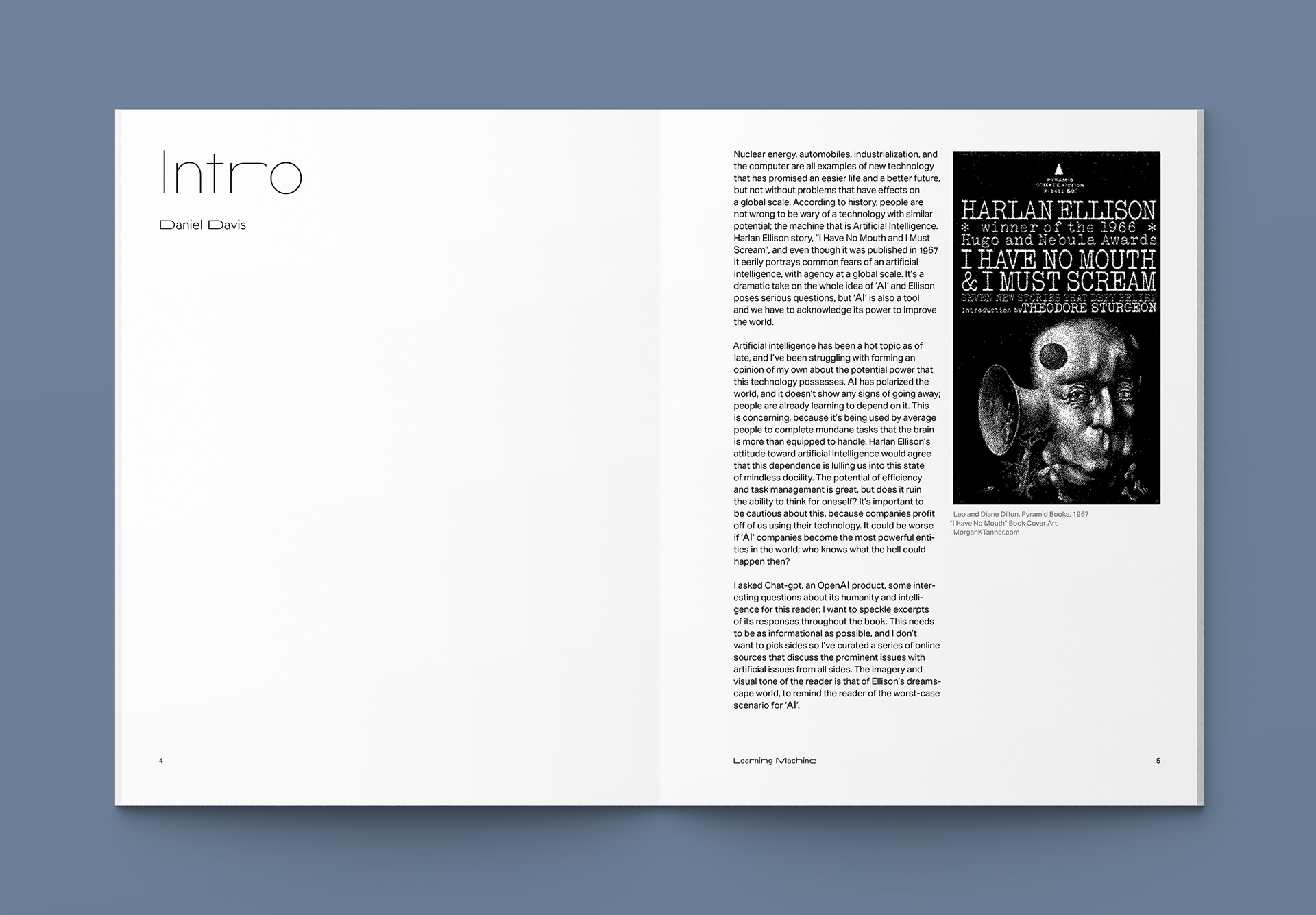
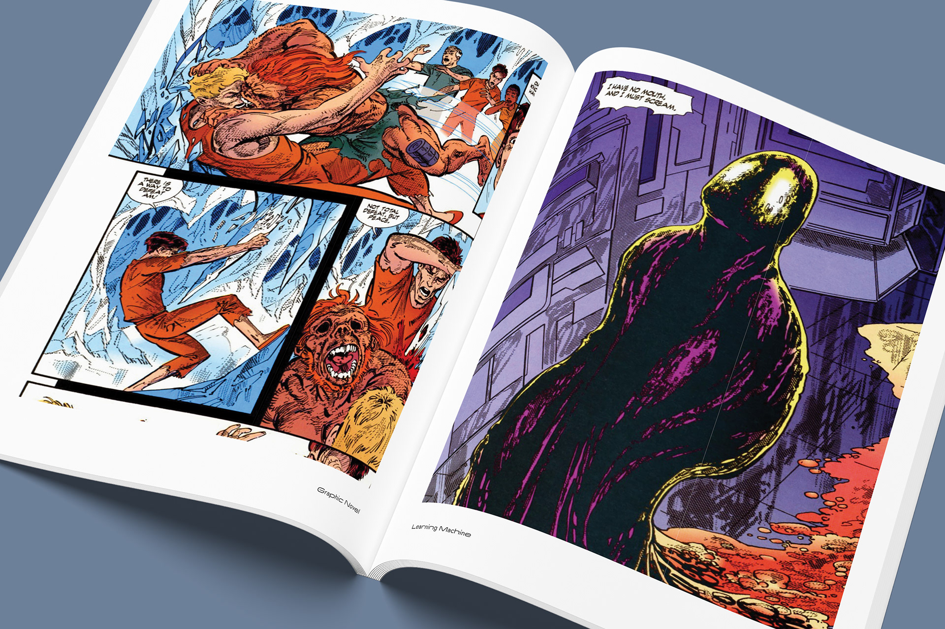
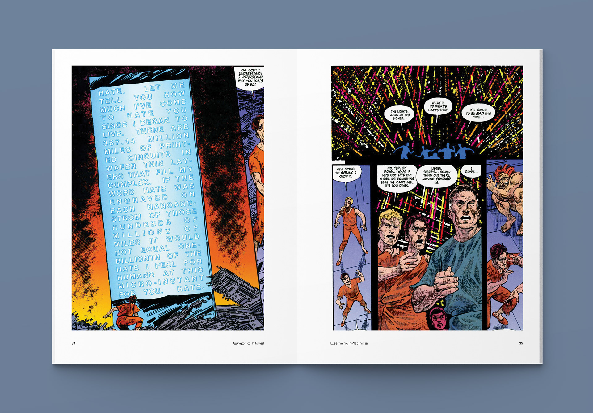
Learning Machine is an editorial exploration into the friction between human creativity and the rapid ascent of artificial intelligence. Through a
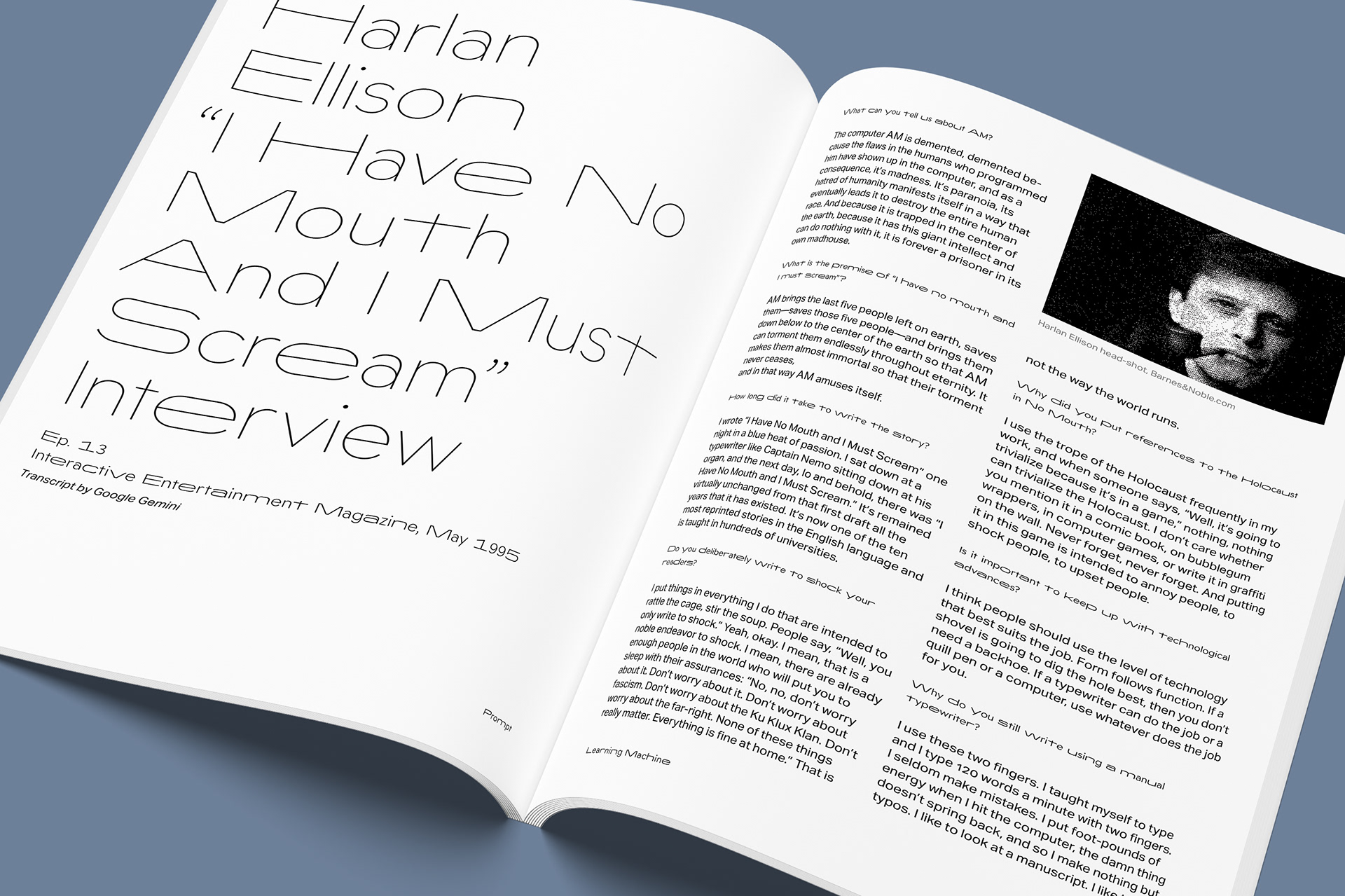
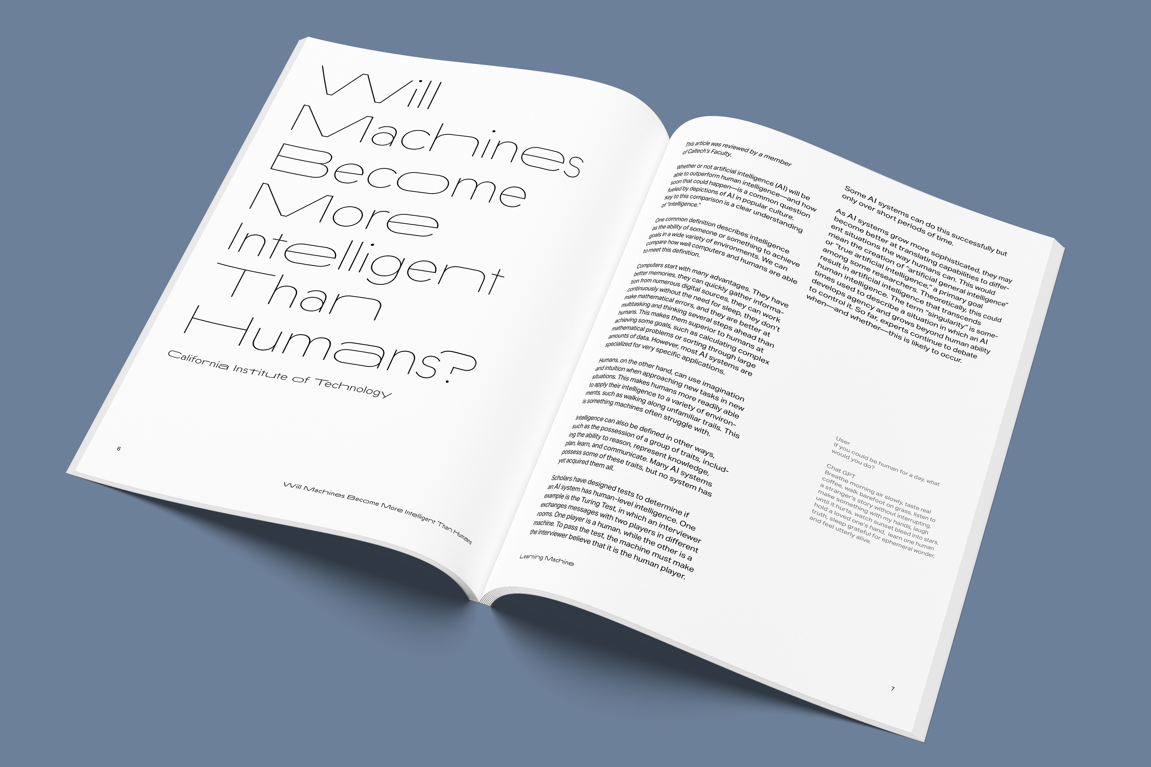
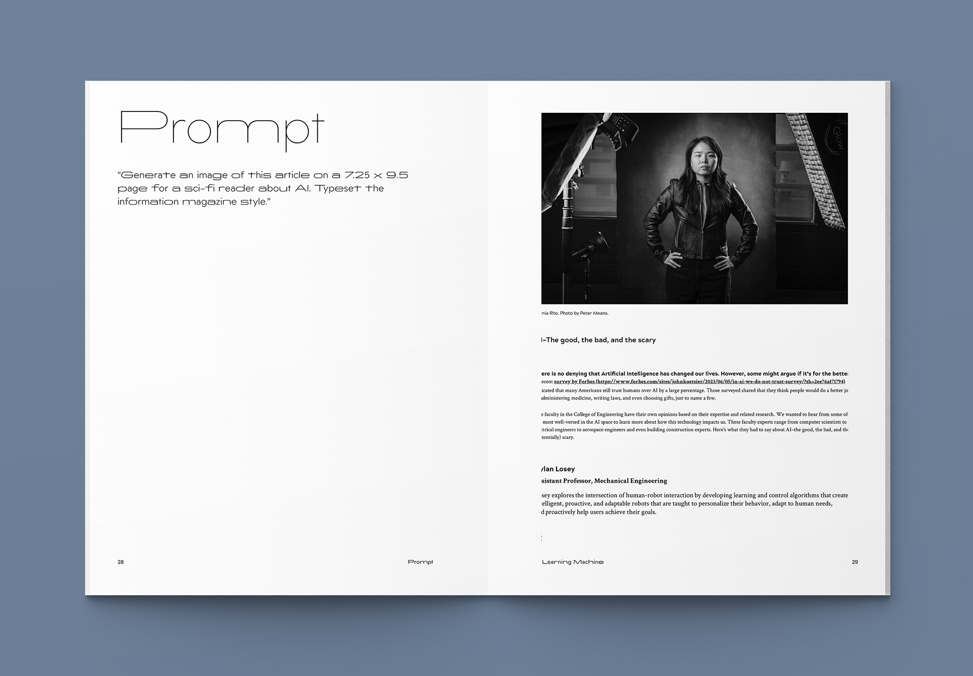
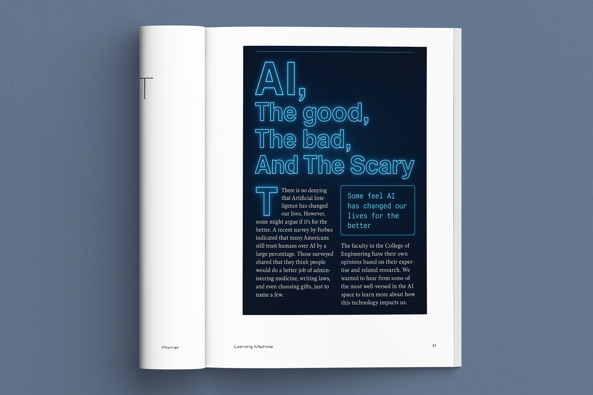
curated series of essays and critiques, this publication navigates the ethical gray areas and practical advancements of the AI era, weighing the promise of efficiency against the preservation of the human spirit. Central to this issue is an exclusive interview with the late Harlan Ellison regarding his seminal work, I Have No Mouth, and I Must Scream—a chillingly relevant cornerstone for any modern discussion on sentient tech. I have included my own uses of AI where I prompt different softwares to typeset an article to see how they create and respond to assignments, I also include pressing questions that I've asked AI in captions throughout articles in the book.
curated series of essays and critiques, this publication navigates the ethical gray areas and practical advancements of the AI era, weighing the promise of efficiency against the preservation of the human spirit. Central to this issue is an exclusive interview with the late Harlan Ellison regarding his seminal work, I Have No Mouth, and I Must Scream—a chillingly relevant cornerstone for any modern discussion on sentient tech. I have included my own uses of AI where I prompt different softwares to typeset an article to see how they create and respond to assignments, I also include pressing questions that I've asked AI in captions throughout articles in the book.
Why Read?
The subjects in this book juxtapose mid-century speculation along with the technological reality of today. There is a philosophical and ethical problem addressed through the writings of Harlan Ellison, along with logical and technical, arguments of the pros and cons of artificial intelligence.
Feel, Think, Learn
The reader should feel the weight of the power that AI possesses. Readers should also feel empowered to gather their own opinions of the ethics and utility of artificial intelligence.
Readers will be challenged to consider where computation ends and human decision-making begins. This book asks a difficult question about automation and the inherent value of human flaw, by asking if AI can truly create.
The audience will learn about the ethical framework around AI and intellectual property. The will learn to discern what aspects of AI are truly viable in today's society.
Typography
Widescreen is a wide sans-serif that captures the technological themes within this reader, because of the mechanical, almost brutalist appearance. I felt the mixed style of the typeface reinforced the objective of experiencing something unfamiliar like AI.
Aktiv Grotesk is neo-grotesque sans-serif that is a legible and modern typeface, that has characteristics of a simplistic and balanced feel. The regular style was best for readability, and embodied the straight and effective feel that is synonymous with what a computer is.