Team: Angel Roman (Manager) | Madalyn Lee (Research) | Edrick Warren (UX) | Daniel Davis (UI)
Problem Statement
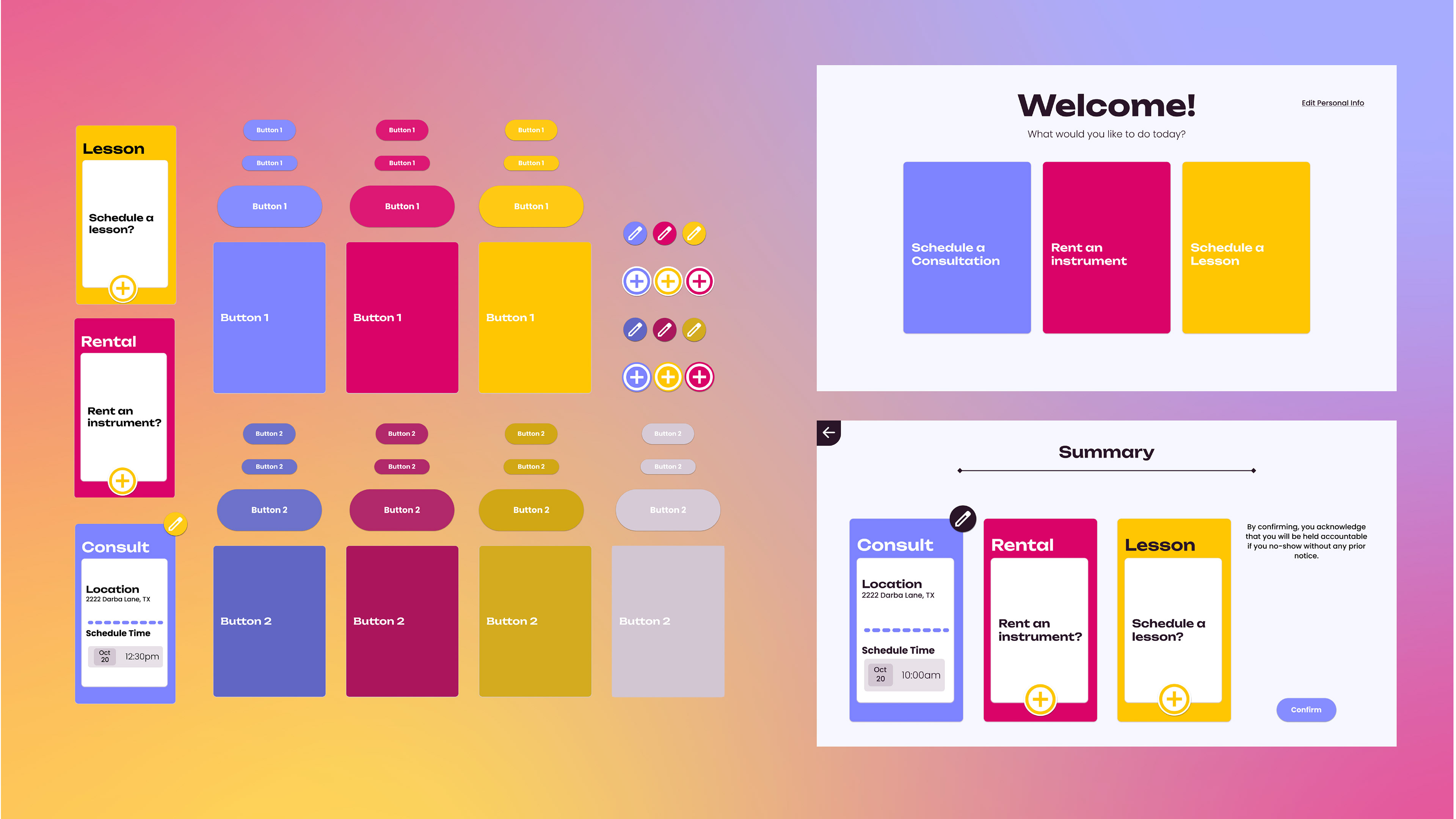
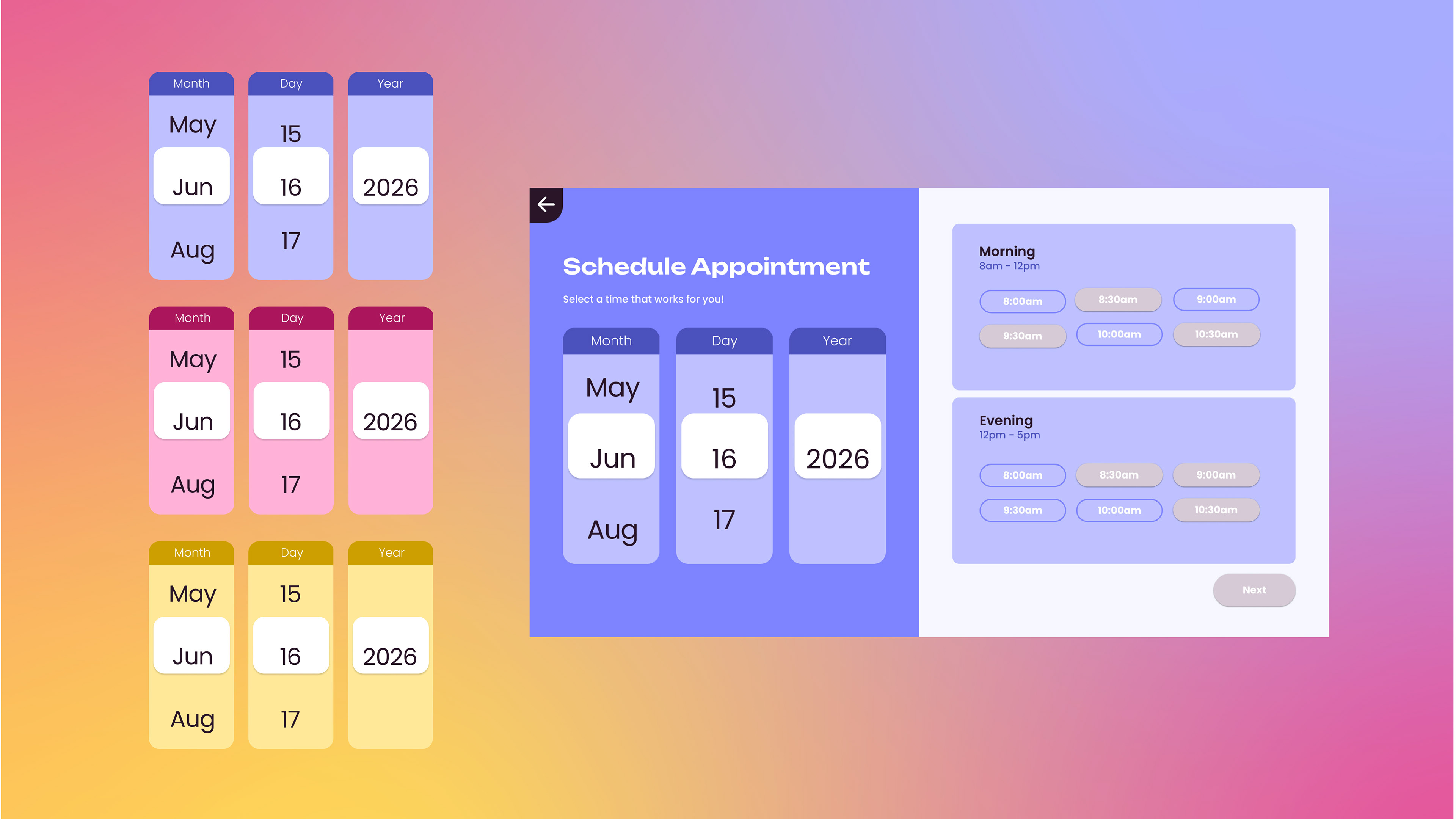
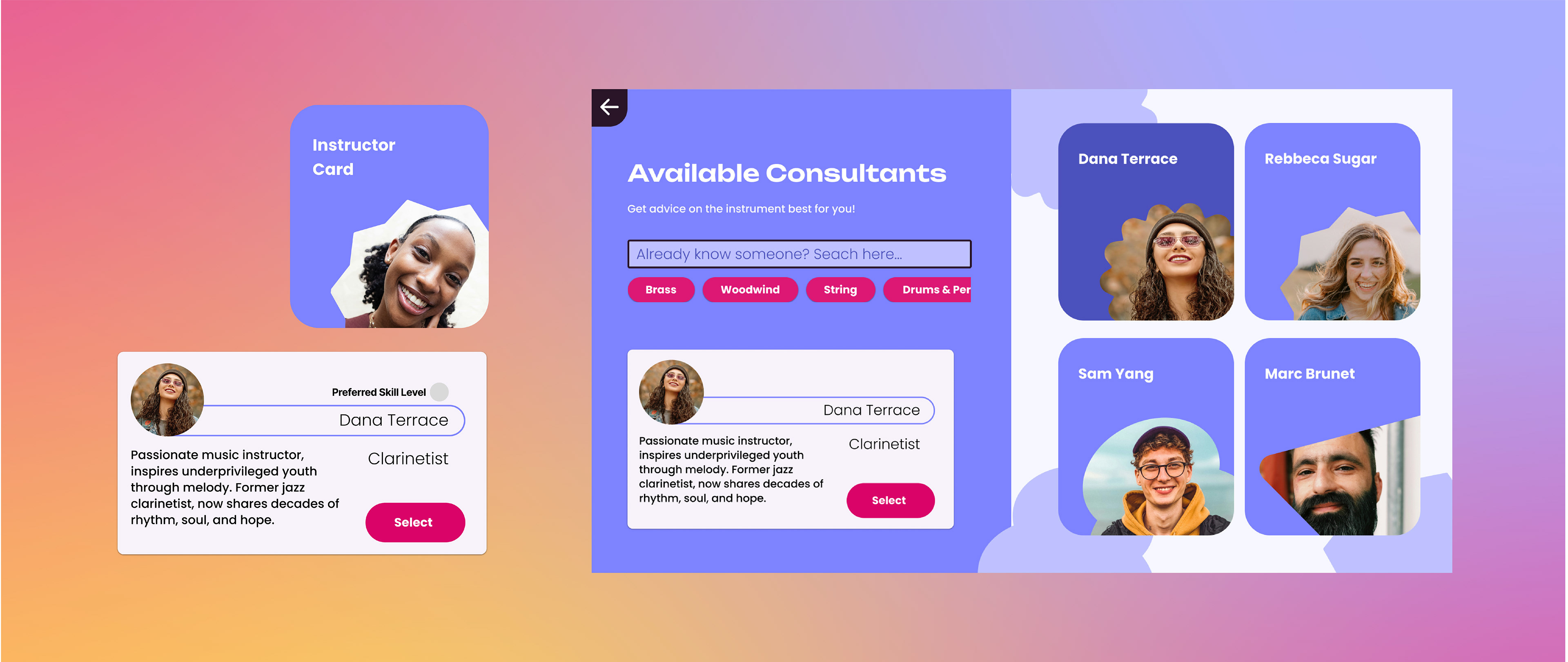
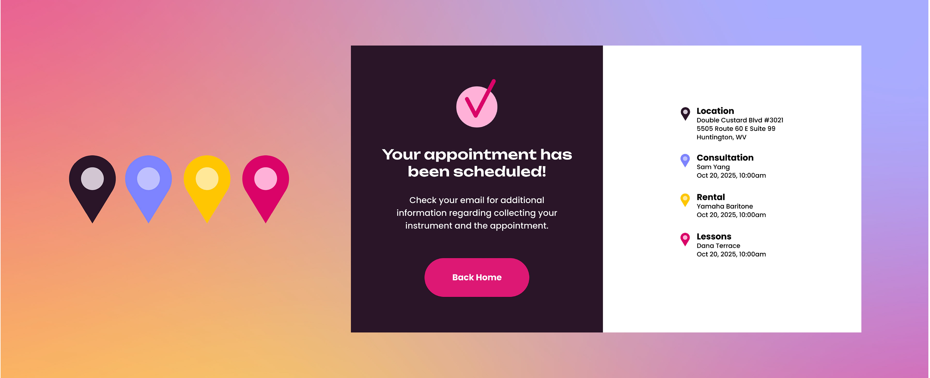
People in underprivileged communities struggle to access music education, afford instruments, and find opportunities when they lack funding, transportation, or support. This limits their cognitive and emotional growth, reduces cultural engagement, and discourages lifelong musical exploration. I wanted the application to look soft and friendly to improve the approachability. I wanted people of all ages to feel comfortable and included when they use the application. I worked closely with my other teammates to create character and color choices to achieve an accessible product.

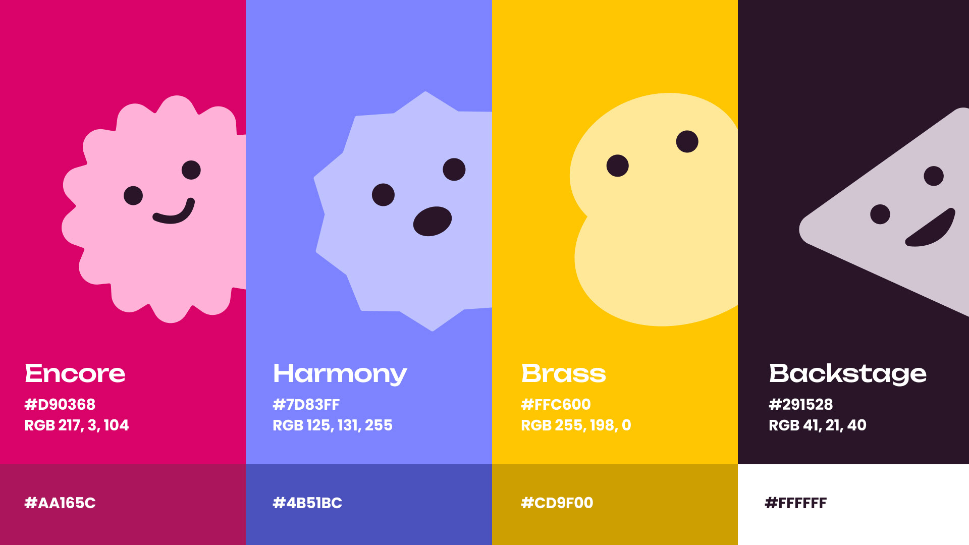
Inclusivity
Music for everyone. Fostering a community where everyone is welcome, of any background and skill level.
Creativity
Embraces imagination, originality, and artistic expression, using bright and playful colors and visuals.
Accessibility
Down-to-earth music education and rentals made easy for everyone to have a chance at music.
Authenticity
Genuine connections with instructors with a kind and helpful tone of voice.
Unbounded had a lot of personality and the counters in the b and d were reminiscent of a musical note that the group really enjoyed. It really matched the fun and personable goals we set for the brand.
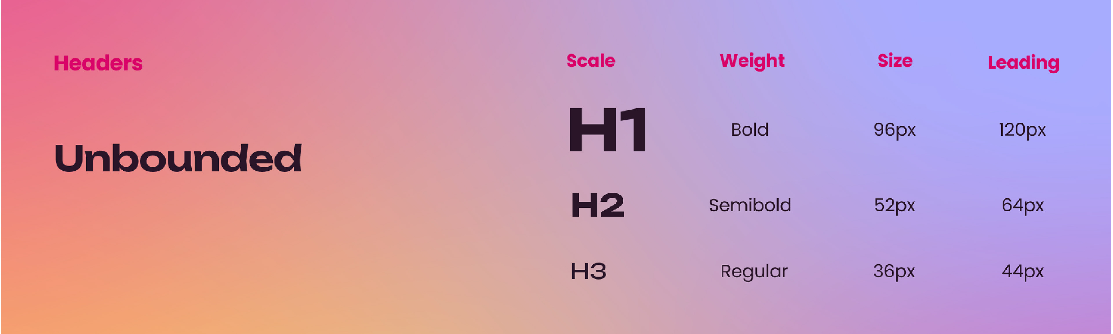
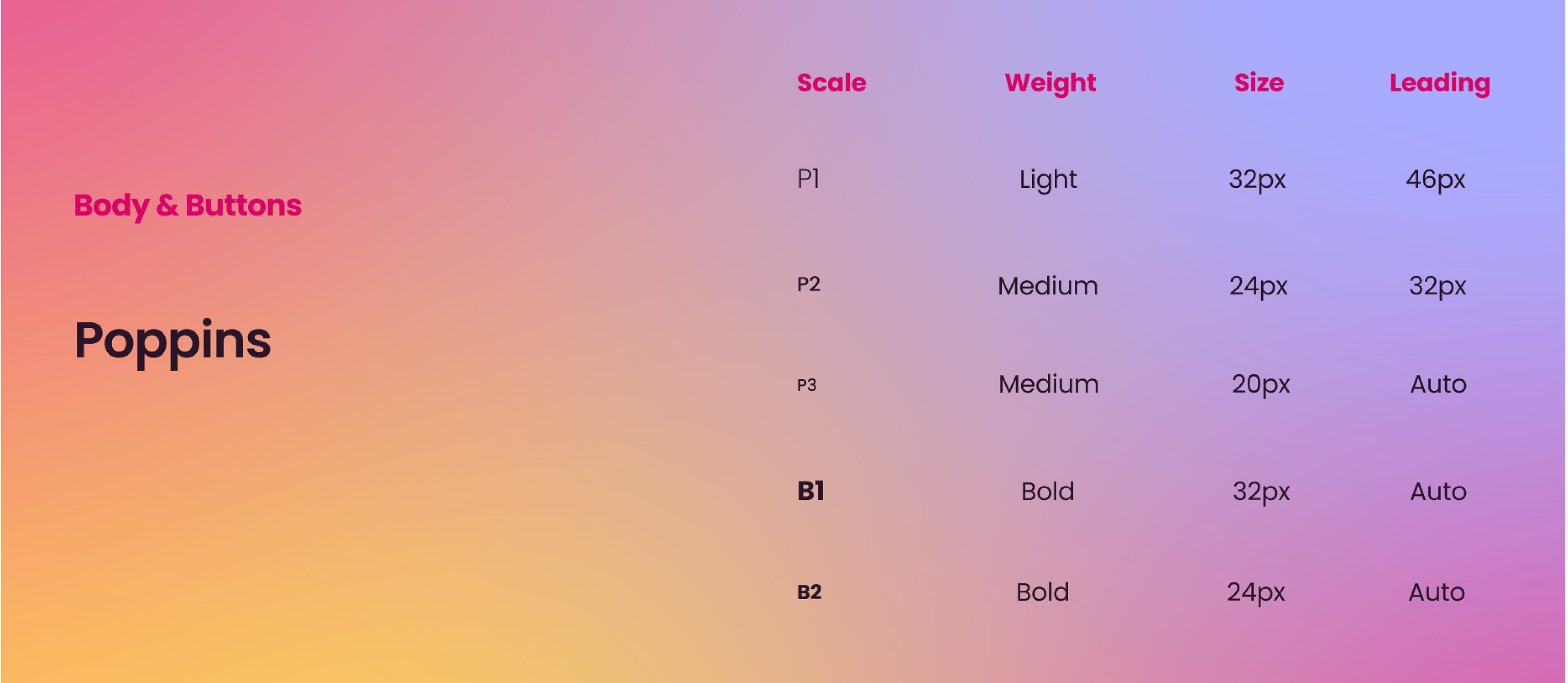
Poppins is easy to read, and had enough contrast to the header typefaces that made it perfect for a friendly, less corporate, appearance.